PARTAKE IN PADUCAH
The Rebrand
The Challenge
A city brand must be a collective expression of an entire community.
Diverse
A brand that celebrates our diversity.
United
And a brand that celebrates our unity.
Diverse
A brand that celebrates our diversity.
United
And a brand that celebrates our unity.

THE SOLUTION: Flipping The branding.
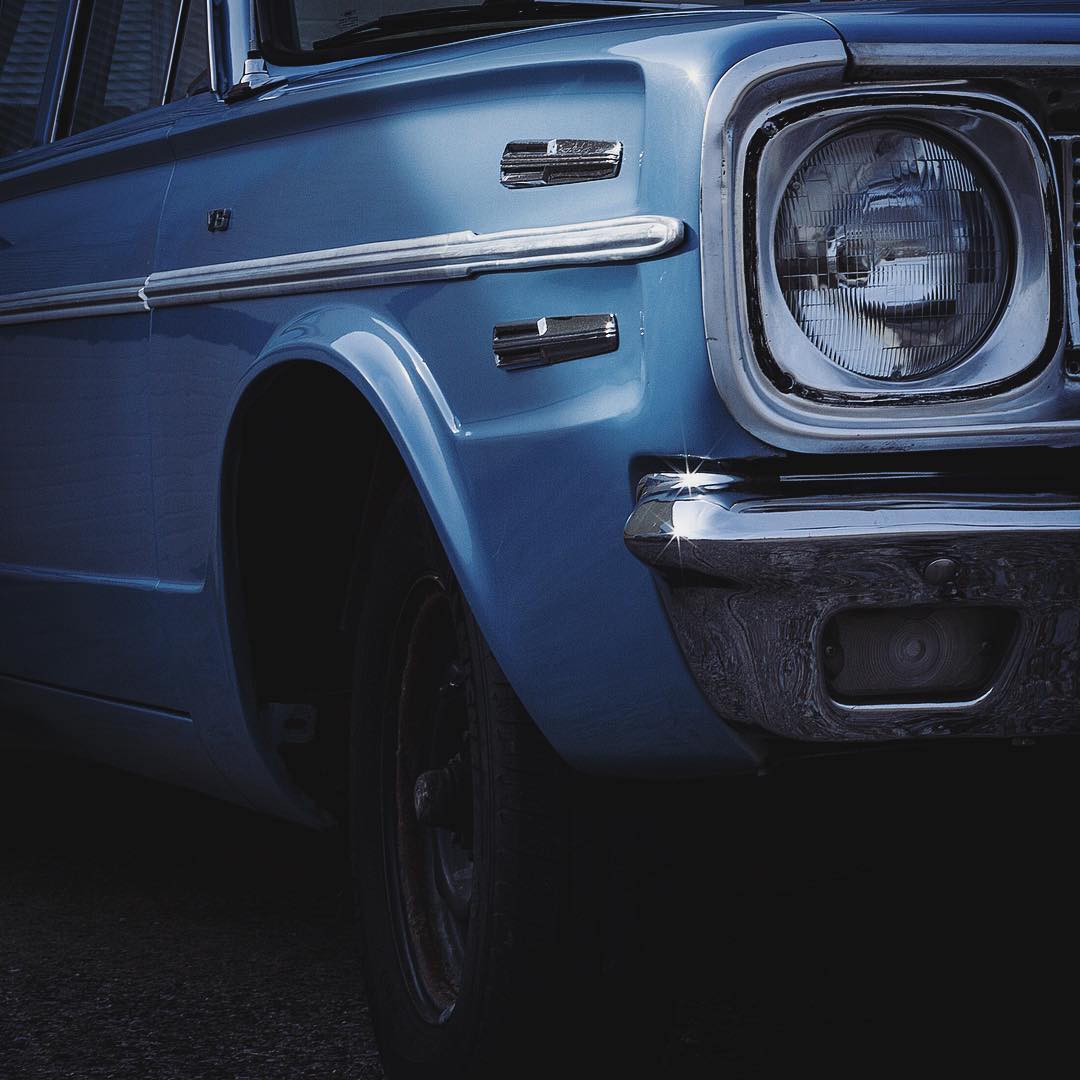
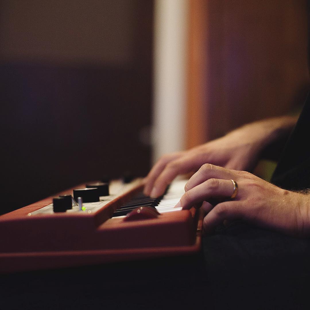
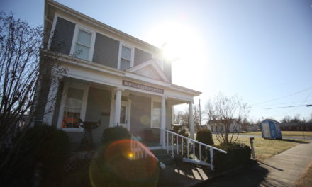
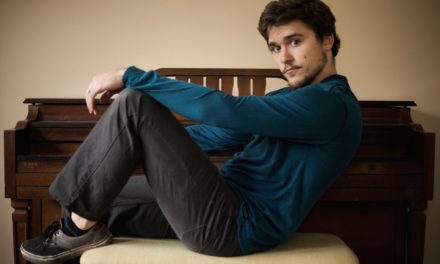
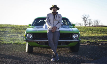
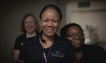
A brand typically creates a look and feel that is then blown out into different environments. The Partake in Paducah brand will take on it’s environment and not the other way around. There are no set colors and the applications and treatments for the logo will continually take on the environment that it is set in. This was done so it could serve and compliment all the textures and images of our city. This brand is ultimately a reflection of this community and you. We want to represent the people, places and things that make it what it is.


Why Does the Arrow Point to the Left?
The arrow was originally placed by the founder as a way to direct people from across the state West. It was an invitation to Partake in all that Paducah and the rest of Western Kentucky has to offer.
The Audience
Our audience is you: our community, our region, our state and those looking at our city from all over the world. We want those that live in our community to feel like they are looking in a mirror when they visit us online and those that have never visited to feel like they are looking through a window at our great city.

